English

Charts and Graphs (Showing Data in Pictures)
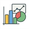
Charts and graphs are visual tools that turn numbers and data into simple pictures, like bar charts…
Reads at Grades 3–5 Listens at Grades 1–5
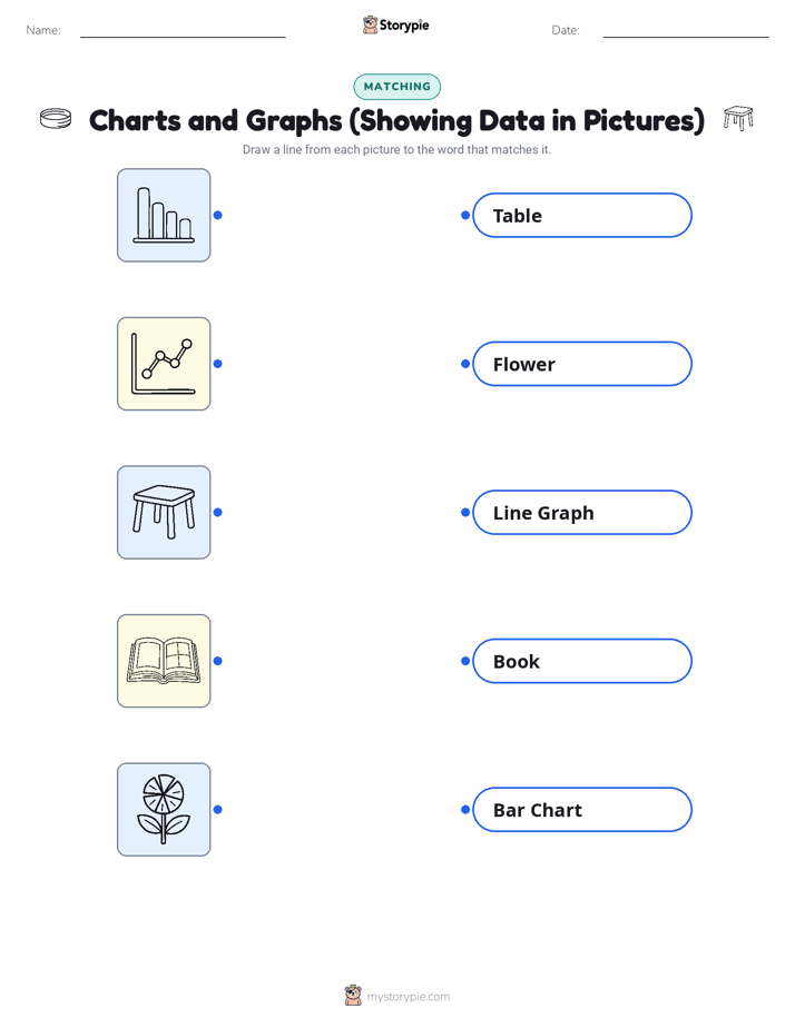
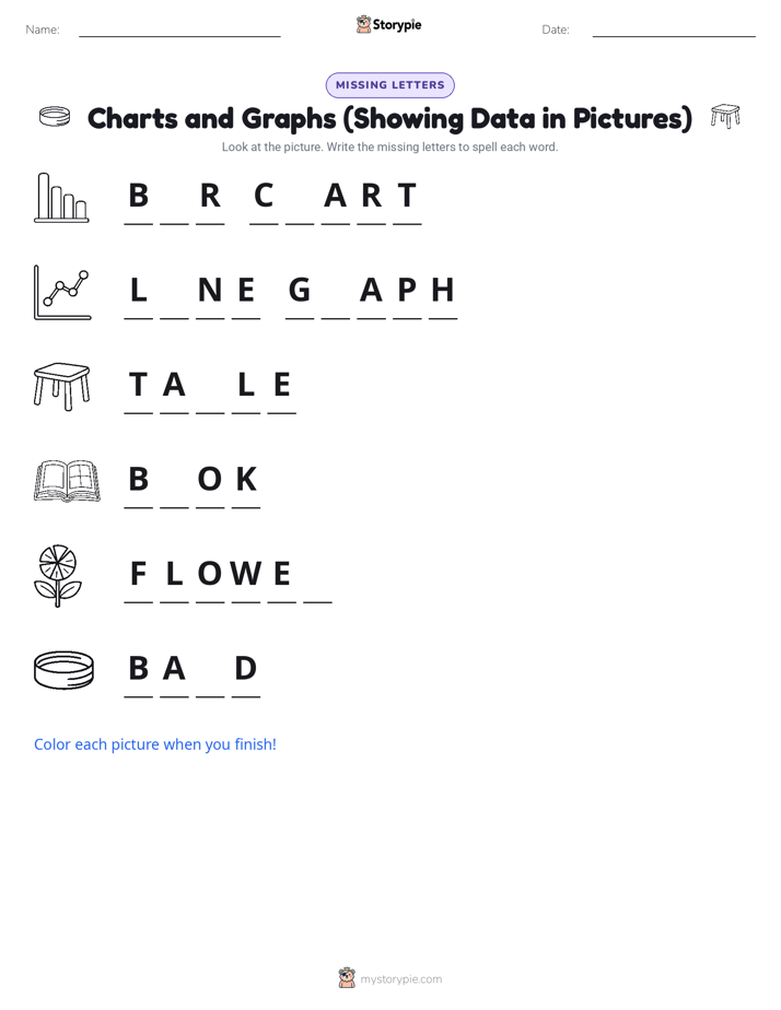
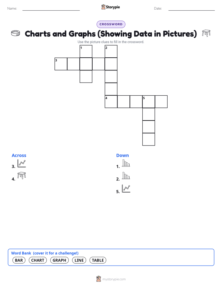
Print & create
Answer keys·No prep·Free with an account
28 worksheets · answer keys · full story · quiz · Ages 8-10 · CEFR B1
Plus adds 244,000+ more stories in 27 languages, audio for every one, and printables for all of them.
Just want Charts and Graphs (Showing Data in Pictures)?
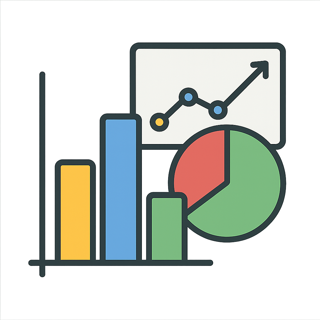
Have you ever looked at a super long list of numbers and felt your eyes go blurry? Maybe your teacher showed you a big table of information about classroom pets, and it felt like a jumble of boring facts. It is hard to tell who has the most fish or the fewest hamsters. Can you imagine a world where you had to read every single number to understand anything? What if there was a magic way to see the whole story behind those numbers in just one glance? Well, that’s me. I take all that confusing data and turn it into a colorful, exciting picture that tells a story. Imagine you asked all your friends what their favorite pizza topping is. You could write down a long list: pepperoni, mushroom, pepperoni, cheese, olive, pepperoni. It is hard to tell which is the most popular, right? But what if you turned that list into a picture? You could make a colorful tower, or a bar, for each topping. The tallest bar would instantly show you that pepperoni is the winner. That’s one of my special powers. I can be a tower, a line that zigs and zags to show how something changes over time, or even a circle cut into slices like a yummy pie. I am the secret that helps you see the patterns and stories hidden in plain sight. I am Charts and Graphs.
My family tree is very old and full of clever thinkers. Long, long ago, before people even had fancy computers, ancient astronomers used simple versions of me. They created tables with neat rows and columns to keep track of the stars and planets moving across the night sky. It was a good start for organizing information, but I was still just a list of numbers. My big glow-up, the moment I started to become the colorful pictures you know today, began in the year 1637. A brilliant French philosopher and mathematician named René Descartes had a fantastic idea while lying in bed watching a fly buzz around his room. He realized he could describe the fly's position using numbers. This led him to create a special grid with lines going up and across, which you might know as the Cartesian coordinate system. It was like a map for numbers, where any point could be found with just two numbers. This grid became the playground where my modern forms could come to life. Then, along came a Scottish engineer and economist named William Playfair, who people now call the 'father of modern charts.' William was tired of staring at endless tables of economic data about imports and exports. He knew there had to be a better, clearer way to show what the numbers meant. So, in 1786, he published a book where he introduced the line graph to show how things changed over time and the bar chart to compare different amounts. Suddenly, people could see the story of money and trade instead of just reading about it. But he wasn’t done. In 1801, he had another tasty idea. He invented the pie chart, which shows how a whole thing is divided into parts, just like slicing up a delicious dessert to share with friends. He gave me the power to not just list facts, but to show them in a way that was quick and easy for anyone to understand.
The Picture That Tells a Thousand Numbers
Have you ever looked at a super long list of numbers and felt your eyes go blurry? Maybe your teacher showed you a big table of information about classroom pets, and it felt like a jumble of boring facts. It is hard to tell who has the most fish or the fewest hamsters. Can you imagine a world where you had to read every single number to understand anything? What if there was a magic way to see the whole story behind those numbers in just one glance? Well, that’s me. I take all that confusing data and turn it into a colorful, exciting picture that tells a story. Imagine you asked all your friends what their favorite pizza topping is. You could write down a long list: pepperoni, mushroom, pepperoni, cheese, olive, pepperoni. It is hard to tell which is the most popular, right? But what if you turned that list into a picture? You could make a colorful tower, or a bar, for each topping. The tallest bar would instantly show you that pepperoni is the winner. That’s one of my special powers. I can be a tower, a line that zigs and zags to show how something changes over time, or even a circle cut into slices like a yummy pie. I am the secret that helps you see the patterns and stories hidden in plain sight. I am Charts and Graphs.
My family tree is very old and full of clever thinkers. Long, long ago, before people even had fancy computers, ancient astronomers used simple versions of me. They created tables with neat rows and columns to keep track of the stars and planets moving across the night sky. It was a good start for organizing information, but I was still just a list of numbers. My big glow-up, the moment I started to become the colorful pictures you know today, began in the year 1637. A brilliant French philosopher and mathematician named René Descartes had a fantastic idea while lying in bed watching a fly buzz around his room. He realized he could describe the fly's position using numbers. This led him to create a special grid with lines going up and across, which you might know as the Cartesian coordinate system. It was like a map for numbers, where any point could be found with just two numbers. This grid became the playground where my modern forms could come to life. Then, along came a Scottish engineer and economist named William Playfair, who people now call the 'father of modern charts.' William was tired of staring at endless tables of economic data about imports and exports. He knew there had to be a better, clearer way to show what the numbers meant. So, in 1786, he published a book where he introduced the line graph to show how things changed over time and the bar chart to compare different amounts. Suddenly, people could see the story of money and trade instead of just reading about it. But he wasn’t done. In 1801, he had another tasty idea. He invented the pie chart, which shows how a whole thing is divided into parts, just like slicing up a delicious dessert to share with friends. He gave me the power to not just list facts, but to show them in a way that was quick and easy for anyone to understand.
Sometimes, a picture can do more than just share information, it can save lives. Let me tell you about one of my proudest moments. It was during the 1850s, in the middle of a conflict called the Crimean War. A very smart and caring nurse named Florence Nightingale went to help the injured soldiers. When she arrived at the army hospitals, she was horrified. The hospitals were crowded and dirty, and she noticed something terrible. More soldiers were dying from sickness and diseases they caught in the hospital than were dying from their wounds in battle. This was a shocking discovery, but it was hard to get the powerful people in the government to listen. They just saw long lists of numbers and did not understand the real problem. So, Florence used me to tell a powerful story. In 1858, she created a special kind of diagram that looked like a colorful, spiky flower, which we now call a polar area chart. Each 'petal' represented a month, and the size of the petal showed how many soldiers had died. She used different colors to show the causes of death. The huge areas of color for disease made it impossible to ignore the truth. When she showed her chart to Queen Victoria and other leaders, they finally understood. Her picture was so convincing that they made huge changes to make hospitals cleaner and safer. I helped her turn data into action, saving thousands of lives.
From ancient star-gazers to brave nurses, I have had quite an adventure through history. But my story isn’t over, because you are part of it now. Today, I am everywhere. Scientists use me to track endangered animals, showing if their populations are growing. Video game designers use me to show player progress with experience bars. Even your favorite weather app uses me to show you the temperature changes throughout the day. You can use me too. The next time you do a school project or want to show your family which board game is the most popular, try drawing a picture of the numbers. Use me to tell your own stories, to share what you learn, and to make sense of the world. Remember, a clear picture can help everyone understand important ideas and see the world in a whole new way.
Wow facts
About
Charts and graphs are visual tools that turn numbers and data into simple pictures, like bar charts, line graphs, and pie charts, making information easier to understand.
Take a Quiz
Question 1 of 5
In the story, I said a pie chart is like 'slicing up a delicious dessert to share with friends.' What does this comparison help you understand?
Explore next





Want to do even more?
Go beyond exploring. Unlock tools that turn every story into real learning.

Storypie Plus for families
Full stories, quizzes, and printables. Nights and car rides, sorted.
- Unlimited audio stories
- Create Mode: your child stars in the story
- Offline downloads
- Printable worksheets & coloring pages

Why Storypie for Schools
Students engaged. Prep in seconds. Evenings back to you.
- Worksheets & Quizzes
- Classroom Management
- Formative Assessment
- Custom Curriculum & Lesson Plans
- 27 Languages

Why Storypie for Homeschool
Curriculum done. They'll ask for more. Hours back in your day.
- Worksheet Generator
- First-Person Audio Stories
- Built-in Comprehension Quizzes
- Custom Curriculum & Lesson Plans
- Print & Go Activities