English

Charts and Graphs (Showing Data in Pictures)
Charts and graphs are visual tools that turn numbers and data into simple pictures, like bar charts…
Reads at Grades 6–8 Listens at Grades 4–8
Print & create
Answer keys·No prep·Free with an account
28 worksheets · answer keys · full story · quiz · Ages 10-12 · CEFR B2
Plus adds 244,000+ more stories in 27 languages, audio for every one, and printables for all of them.
Just want Charts and Graphs (Showing Data in Pictures)?

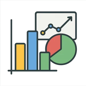
Have you ever tried to explain something really complicated. Maybe you tried to tell a friend about every single point scored in a whole basketball season, or list every type of pizza topping your class voted for. It’s a lot of words and numbers, right. It can get confusing, and honestly, a little boring. That’s where I come in. I take those jumbles of numbers and tangled-up facts and turn them into a picture. Suddenly, you can see the whole story in a single glance. You can see the moment your team’s score shot up, or which pizza topping was the clear winner. I am a secret decoder for the language of numbers. I can look like a mountain range of rising and falling lines, a row of colorful blocks standing at attention, or even a pizza cut into different-sized slices. I don’t use words to tell my stories; I use shapes, colors, and space to make information clear, fast, and fascinating. I help you see patterns you’d never find just by reading lists. So, what am I. I am Charts and Graphs, and I’m here to show you the world in a whole new way.
For a very long time, people used me in simple ways without even knowing it. Ancient astronomers drew maps of the stars, which were a kind of chart showing the positions of planets and constellations. But my true birthday as a tool for understanding data happened much more recently. Before the late 1700s, if you wanted to understand things like how much a country was buying or selling, you had to stare at huge, boring tables filled with numbers. It was like trying to find one specific grain of sand on a whole beach. Then, in 1786, a brilliant and creative Scottish engineer named William Playfair had an amazing idea. He was tired of those endless tables. He thought, 'What if I could make numbers speak. What if I could draw a picture of them.'. So he did. He published a book called 'The Commercial and Political Atlas,' and inside, he introduced the world to some of my best friends: the line graph and the bar chart. For the first time, people could see the rise and fall of a country's economy over years, just by following a line. A few years later, on December 1st, 1801, he introduced another famous relative of mine in his new book, the 'Statistical Breviary.'. It was the pie chart. He used it to show the size of different empires as slices of a circle. William Playfair gave me my start, turning me from a simple map into a powerful storyteller for numbers.
The Story of Charts and Graphs
Have you ever tried to explain something really complicated. Maybe you tried to tell a friend about every single point scored in a whole basketball season, or list every type of pizza topping your class voted for. It’s a lot of words and numbers, right. It can get confusing, and honestly, a little boring. That’s where I come in. I take those jumbles of numbers and tangled-up facts and turn them into a picture. Suddenly, you can see the whole story in a single glance. You can see the moment your team’s score shot up, or which pizza topping was the clear winner. I am a secret decoder for the language of numbers. I can look like a mountain range of rising and falling lines, a row of colorful blocks standing at attention, or even a pizza cut into different-sized slices. I don’t use words to tell my stories; I use shapes, colors, and space to make information clear, fast, and fascinating. I help you see patterns you’d never find just by reading lists. So, what am I. I am Charts and Graphs, and I’m here to show you the world in a whole new way.
For a very long time, people used me in simple ways without even knowing it. Ancient astronomers drew maps of the stars, which were a kind of chart showing the positions of planets and constellations. But my true birthday as a tool for understanding data happened much more recently. Before the late 1700s, if you wanted to understand things like how much a country was buying or selling, you had to stare at huge, boring tables filled with numbers. It was like trying to find one specific grain of sand on a whole beach. Then, in 1786, a brilliant and creative Scottish engineer named William Playfair had an amazing idea. He was tired of those endless tables. He thought, 'What if I could make numbers speak. What if I could draw a picture of them.'. So he did. He published a book called 'The Commercial and Political Atlas,' and inside, he introduced the world to some of my best friends: the line graph and the bar chart. For the first time, people could see the rise and fall of a country's economy over years, just by following a line. A few years later, on December 1st, 1801, he introduced another famous relative of mine in his new book, the 'Statistical Breviary.'. It was the pie chart. He used it to show the size of different empires as slices of a circle. William Playfair gave me my start, turning me from a simple map into a powerful storyteller for numbers.
My pictures aren’t just for showing money or votes—they can also be heroes. One of my proudest moments was when I worked with a truly remarkable woman named Florence Nightingale. In the 1850s, she was a nurse during the Crimean War. It was a terrible time, and many soldiers were dying. But Florence noticed something that others weren't seeing clearly: more soldiers were dying from sickness and infections in the dirty hospitals than from their wounds in battle. She collected mountains of data to prove it, but just telling the government the numbers wasn't enough. They didn't understand the urgency. So, in 1858, she asked for my help. Together, we created a new kind of chart she called a 'coxcomb' or a polar area diagram. It looked like a flower with different-sized wedges. The huge, dark-colored wedges showed the thousands of soldiers who died from preventable diseases, while the tiny slivers showed those who died from fighting. When she showed this picture to Queen Victoria and the British Parliament, they were shocked. They couldn't ignore the story my shapes were telling. Because of the powerful, clear picture we made, they finally took action to clean up the hospitals. My simple drawing helped Florence Nightingale change nursing forever and save countless lives.
Sometimes, I can tell a whole epic story in a single image, full of drama and detail. One of the most famous pictures I ever helped create was drawn in 1869 by a French engineer named Charles Joseph Minard. He wanted to show the tragic story of Napoleon Bonaparte's invasion of Russia in 1812. He designed a flow map that is still studied today for its genius. It showed a thick, tan-colored band representing Napoleon's huge army of over 400,000 soldiers marching toward Moscow. As the army lost men to fighting and starvation, you can see the band get thinner and thinner. Then, a thin black line shows the tiny, struggling group of survivors—only about 10,000—who made the long, freezing journey back. Minard even included a line graph at the bottom showing the brutal, dropping temperatures during the retreat. In one single picture, he captured the distance, the direction, the number of soldiers, and the bitter cold. He used me to show the devastating human cost of war in a way that numbers in a table never could.
Today, I’m everywhere. I’m on your computer when you look up sports statistics, I’m in your science textbook showing how a plant grows, and I’m on the news explaining weather patterns. I help scientists track climate change and doctors understand how a medicine is working. I’ve grown from simple hand-drawn lines into interactive, 3D graphics you can explore on a screen. But my job is still the same as it was in William Playfair’s time: to make the complicated simple and to reveal the stories hidden in data. I am a universal language that anyone can understand, no matter where they are from. So next time you see a list of numbers, think of me. What story is hiding in there. What picture could you draw to bring it to life. I’m here to help you see the world more clearly and to share your own important stories with everyone.
Wow facts
About
Charts and graphs are visual tools that turn numbers and data into simple pictures, like bar charts, line graphs, and pie charts, making information easier to understand.
Take a Quiz
Question 1 of 5
What was the main problem that Florence Nightingale's 'coxcomb' chart solved?
Explore next





Want to do even more?
Go beyond exploring. Unlock tools that turn every story into real learning.

Storypie Plus for families
Full stories, quizzes, and printables. Nights and car rides, sorted.
- Unlimited audio stories
- Create Mode: your child stars in the story
- Offline downloads
- Printable worksheets & coloring pages

Why Storypie for Schools
Students engaged. Prep in seconds. Evenings back to you.
- Worksheets & Quizzes
- Classroom Management
- Formative Assessment
- Custom Curriculum & Lesson Plans
- 27 Languages

Why Storypie for Homeschool
Curriculum done. They'll ask for more. Hours back in your day.
- Worksheet Generator
- First-Person Audio Stories
- Built-in Comprehension Quizzes
- Custom Curriculum & Lesson Plans
- Print & Go Activities