English

Charts and Graphs (Showing Data in Pictures)
Charts and graphs are visual tools that turn numbers and data into simple pictures, like bar charts…
Reads at Grades K-2 Listens at K–3
Print & create
Answer keys·No prep·Free with an account
28 worksheets · answer keys · full story · quiz · Ages 6-8 · CEFR A2
Plus adds 244,000+ more stories in 27 languages, audio for every one, and printables for all of them.
Just want Charts and Graphs (Showing Data in Pictures)?

Imagine you have a giant glass jar filled with yummy candies. There are red ones, blue ones, green ones, and yellow ones, all mixed up. If you wanted to know which color you had the most of, what would you do? You could try to count them one by one, but that would take a very long time and your brain might get all fuzzy. But what if you could turn that jumble of candies into neat, colorful towers? You could make a tall tower of red candies, a shorter tower of blue ones, and a tiny little tower for the green ones. Just by looking, you would instantly know which color was the winner. That’s what I do. I take big, confusing piles of numbers and information and turn them into simple, clear pictures that tell a story. I’m like a picture detective, searching for clues hidden inside numbers. Hello there. I am Charts and Graphs, and my superpower is turning numbers into stories you can see.
For a long, long time, people only had long lists of numbers to look at. Imagine trying to read your favorite story, but all the words were just in one long, jumbled list. It would be very hard to understand. That’s what it was like with numbers before I came along. Then, a very smart man from Scotland named William Playfair had a brilliant idea. In the year 1786, he decided that numbers would be much easier to understand if they were pictures. So, he created the very first bar chart. He used tall and short bars to show information, making it super easy to compare things just by looking. He was so excited that he kept inventing. A few years later, in 1801, he created my fun cousin, the pie chart. It looks just like a pizza or a pie cut into slices, and each slice shows a part of a whole group. Many years after that, a kind and brave nurse named Florence Nightingale used my power to save lives. During a war in the 1850s, she noticed that many soldiers were getting sick in dirty hospitals. She used a special chart that looked like a colorful flower to show that more soldiers needed clean hospitals than anything else. Her picture-story was so clear and powerful that it convinced important people to make hospitals cleaner, saving thousands of people.
I am Charts and Graphs
Imagine you have a giant glass jar filled with yummy candies. There are red ones, blue ones, green ones, and yellow ones, all mixed up. If you wanted to know which color you had the most of, what would you do? You could try to count them one by one, but that would take a very long time and your brain might get all fuzzy. But what if you could turn that jumble of candies into neat, colorful towers? You could make a tall tower of red candies, a shorter tower of blue ones, and a tiny little tower for the green ones. Just by looking, you would instantly know which color was the winner. That’s what I do. I take big, confusing piles of numbers and information and turn them into simple, clear pictures that tell a story. I’m like a picture detective, searching for clues hidden inside numbers. Hello there. I am Charts and Graphs, and my superpower is turning numbers into stories you can see.
For a long, long time, people only had long lists of numbers to look at. Imagine trying to read your favorite story, but all the words were just in one long, jumbled list. It would be very hard to understand. That’s what it was like with numbers before I came along. Then, a very smart man from Scotland named William Playfair had a brilliant idea. In the year 1786, he decided that numbers would be much easier to understand if they were pictures. So, he created the very first bar chart. He used tall and short bars to show information, making it super easy to compare things just by looking. He was so excited that he kept inventing. A few years later, in 1801, he created my fun cousin, the pie chart. It looks just like a pizza or a pie cut into slices, and each slice shows a part of a whole group. Many years after that, a kind and brave nurse named Florence Nightingale used my power to save lives. During a war in the 1850s, she noticed that many soldiers were getting sick in dirty hospitals. She used a special chart that looked like a colorful flower to show that more soldiers needed clean hospitals than anything else. Her picture-story was so clear and powerful that it convinced important people to make hospitals cleaner, saving thousands of people.
Today, you can find me helping people everywhere you look. I pop up in your science books to show you how a tiny seed grows into a tall sunflower over many days. You can see me on the weather report on TV, where a wiggly line shows if the day will be hot or cold. I’m even in your favorite video games. That colorful bar that shows your character’s health or the tower that shows your high score? That’s me, working my magic. I help scientists discover amazing things about our world, I help doctors understand how to keep people healthy, and I help kids like you see the stories that are hidden all around you. Anytime you see a picture made of bars, lines, or slices of a circle, you’ll know it’s me, making the world a clearer and more interesting place.
Wow facts
About
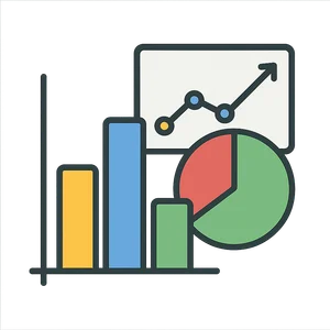
Charts and graphs are visual tools that turn numbers and data into simple pictures, like bar charts, line graphs, and pie charts, making information easier to understand.
Take a Quiz
Question 1 of 4
Why did Florence Nightingale use a chart in the 1850s?
Explore next





Want to do even more?
Go beyond exploring. Unlock tools that turn every story into real learning.

Storypie Plus for families
Full stories, quizzes, and printables. Nights and car rides, sorted.
- Unlimited audio stories
- Create Mode: your child stars in the story
- Offline downloads
- Printable worksheets & coloring pages

Why Storypie for Schools
Students engaged. Prep in seconds. Evenings back to you.
- Worksheets & Quizzes
- Classroom Management
- Formative Assessment
- Custom Curriculum & Lesson Plans
- 27 Languages

Why Storypie for Homeschool
Curriculum done. They'll ask for more. Hours back in your day.
- Worksheet Generator
- First-Person Audio Stories
- Built-in Comprehension Quizzes
- Custom Curriculum & Lesson Plans
- Print & Go Activities